Issue 01: Genesis
Turquoise Is Not a Color. It's a Place.
ionicvoidFeb 6, 202615 minUpdated Feb 6, 2026
A Color That Travels
Nobody remembers turquoise objectively.
You remember where you were. The water. The sky meeting it. The feeling that you'd escaped something, even if you couldn't name what.
Turquoise doesn't sit still in your mind. It takes you somewhere.
Caribbean Arrivals
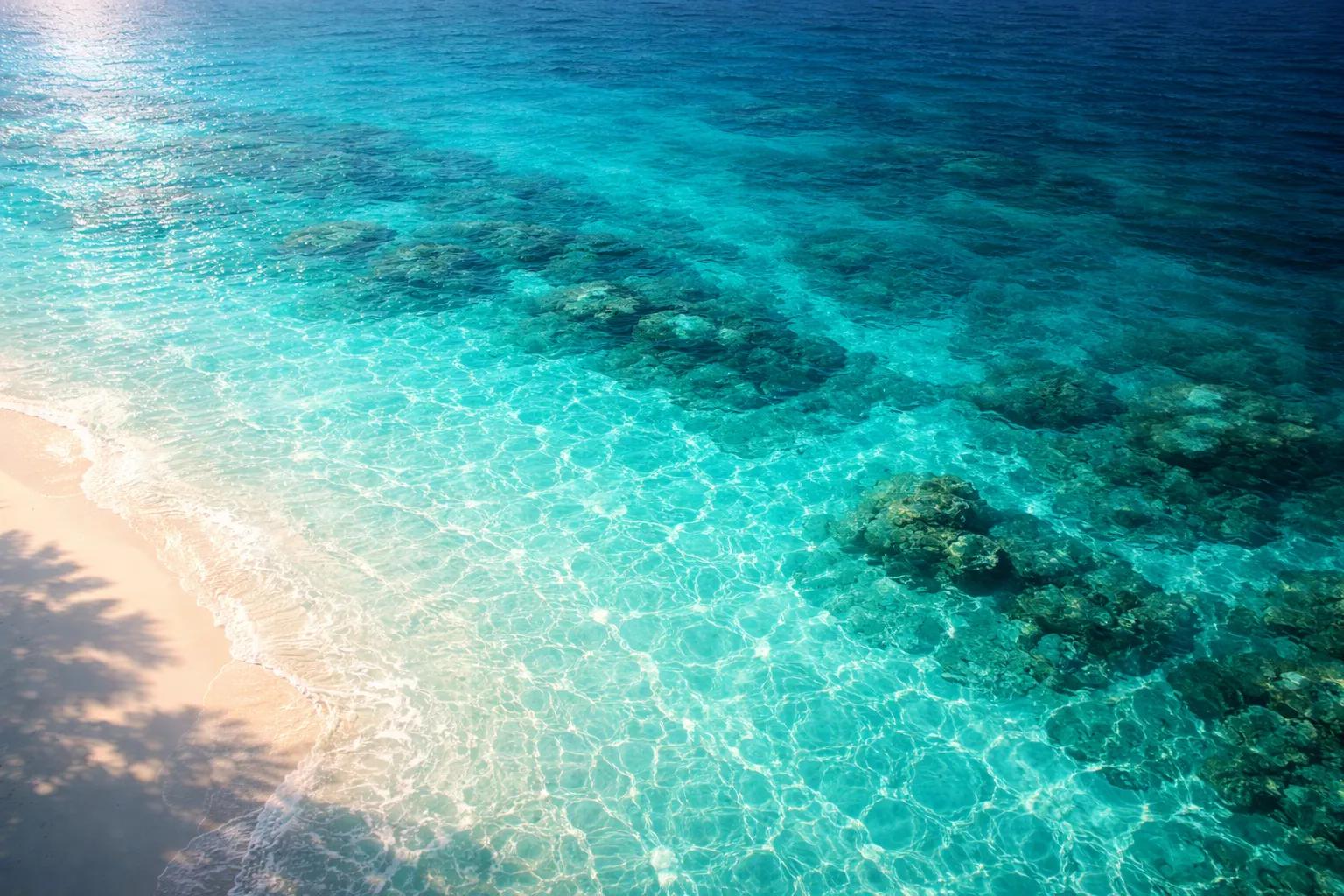
I saw it first as a kid. Caribbean water off Florida, then a different island every year with my family. That color wasn't like any blue I knew from home. It was too clear. Too vivid. It made the shallow water feel safe and the deep water feel like a secret.
I didn't know the word turquoise yet. I just knew that color made me feel like I'd arrived somewhere that mattered.
Turkish Stone
The name comes from the French. Pierre turquoise. Turkish stone. Not because Turkey made it, but because that's where Europe first encountered it. Trade routes from Persia passing through Turkish markets. The stone predates the name by thousands of years.
Ancient Egyptians lined Tutankhamun's burial mask with it. The Aztecs reserved it for gods and kings. Persians covered mosque domes in it because they believed it was the color of heaven reflected down.
Every culture that found turquoise gave it the same job: protection. Connection to sky. Something between earth and the infinite.
The Intersection
Why does it feel both calm and electric?
Turquoise sits at the intersection of blue and green on the spectrum. Blue pulls you inward. Cool. Recessive. Safe. Green activates. Growth. Movement. Life.
Turquoise holds both at once. That's why it never feels finished. It's not asking you to relax or to act. It's asking you to stay.
Water does this too. Shallow tropical water isn't passive. It's constantly shifting. Light refracts. Sand reflects. The color changes every time a cloud moves. Turquoise isn't one color. It's the idea of presence itself.
The Startup Trap
Tech companies figured this out.
Open any startup's landing page from 2015-2020. Turquoise everywhere. Accent buttons. Gradient backgrounds. App icons. They weren't choosing calm. They weren't choosing energy. They were choosing both. Trust and action. Safety and forward motion.
Most of them got it wrong.
Turquoise works in nature because it's never flat. The color breathes. On a screen, compressed into a hex code, it often feels cheap. Forced. Like someone ran "friendly but innovative" through a brand generator.
The difference between turquoise that works and turquoise that fails is context. In water, it earns its complexity. On a button, it usually lies.
The Photos I Keep
I've noticed something about how I photograph.
When I travel, I take pictures of places. Architecture. Food. People. But the photos I actually look at later are almost always water. And almost always that specific color.
I don't think I'm photographing a location. I think I'm trying to hold the feeling of being somewhere I didn't want to leave.
Turquoise is the color of wanting to stay.
Why It Fails as a Neutral
That's why it doesn't work as a neutral.
Designers sometimes try to use turquoise as a "fresh" alternative to blue. Less corporate. More approachable. It fails almost every time.
Blue can be neutral. It can fade into the background. Turquoise can't. It carries too much. Safety. Escape. Memory. Arrival.
Every time you use turquoise, you're saying something whether you mean to or not. You're saying: this matters. This is a place, not a pass-through.
First Color
The first color I remember is turquoise.
Not because it was bright. Not because I learned the name. Because it told me something I didn't have words for yet.
That color meant I was somewhere else. Somewhere worth being.
All these years later, I'm still chasing that feeling.
ionicvoid is the founder of Hue42 and the artist behind Chronos Chromatic. He still takes too many photos of water.